8 Things I Love About Squarespace Fluid Engine and 1 Big Thing I Don’t

In the summer of 2022 Squarespace introduced ‘Fluid Engine’ its new website editor. There was a lot of apprehension in the Squarespace design community. It’s normal human behavior to resist change.
I had a wait and see attitude. I wasn’t super worried about it. My business revenues do not hinge on years worth of recorded Squarespace tutorial videos or Squarespace plugins for features that are now part of Fluid Engine.
A big change in how Squarespace works would certainly make that massive amount of rework frustrating.
The way I see it, though, is that this is one of the risks of hinging your business model to a specific platform. I say that as a Squarespace designer that is all in!
I’ve been a casual Squarespace user for several years, but only became a serious Squarespace designer in 2019. One of the reasons I liked the platform was that I felt it had ‘design guard rails’.
Squarespace was configured in a way that didn’t allow non-designers (aka clients!) to make too much of a mess of their sites.
However, I often also felt frustrated by these website layout editor constraints. I was annoyed that I needed to use CSS to make the most simple of design tweaks. Fluid Engine has remedied a lot of this and I love the new flexibility.
Up until now I have advised my clients to stay on ‘Classic Editor’. Until July of 2022 I had designed in Squarespace 7.1. This is what my clients up until then were used to, and I wanted them to stay with what they knew.
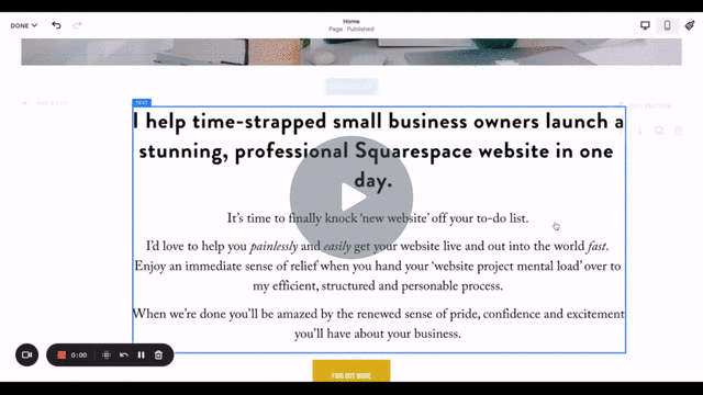
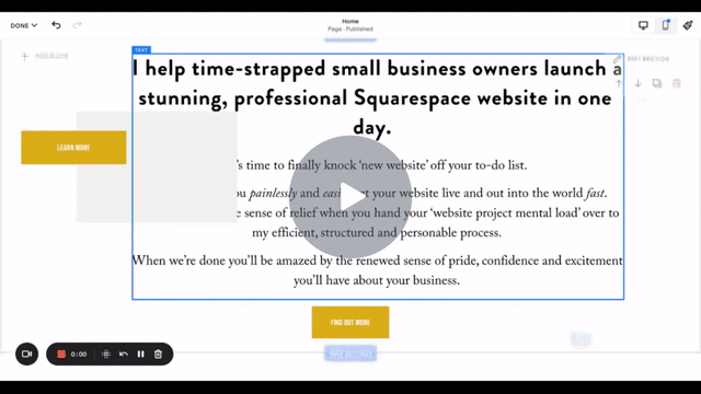
Once I experimented with Fluid Engine, I dove right in.
As with moving from 7.0 to 7.1 I like to just close my eyes and jump in. There is a learning curve of course, but now I pretty much refuse to work with Squarespace 7.0 websites and I’m starting to feel that way with Squarespace Classic Editor sites.
Helpfully you can upgrade a 7.1 site from Classic Editor to Fluid Engine section by section. You just need to go into the settings and enable Fluid Engine.
So after that long preamble here are the 8 things I’m really loving about Squarespace Fluid Engine.
1. A visible, somewhat flexible Grid
A background grid existed in Squarespace Classic, but it wasn’t visible; objects just snapped to it. Now when you move elements around the page section you while using the Fluid Engine editor you can see a background grid.
This is helpful because you can visually see where an element will land.
You can also edit the space between the rows and columns, it’s not 100% flexible but it’s a vast improvement.
It does give you a significant more amount of control while designing your website.
There’s a lot more to it than this. The page sections are a lot more, well fluid and flexible. I recommend trying it out yourself.
2. Shapes
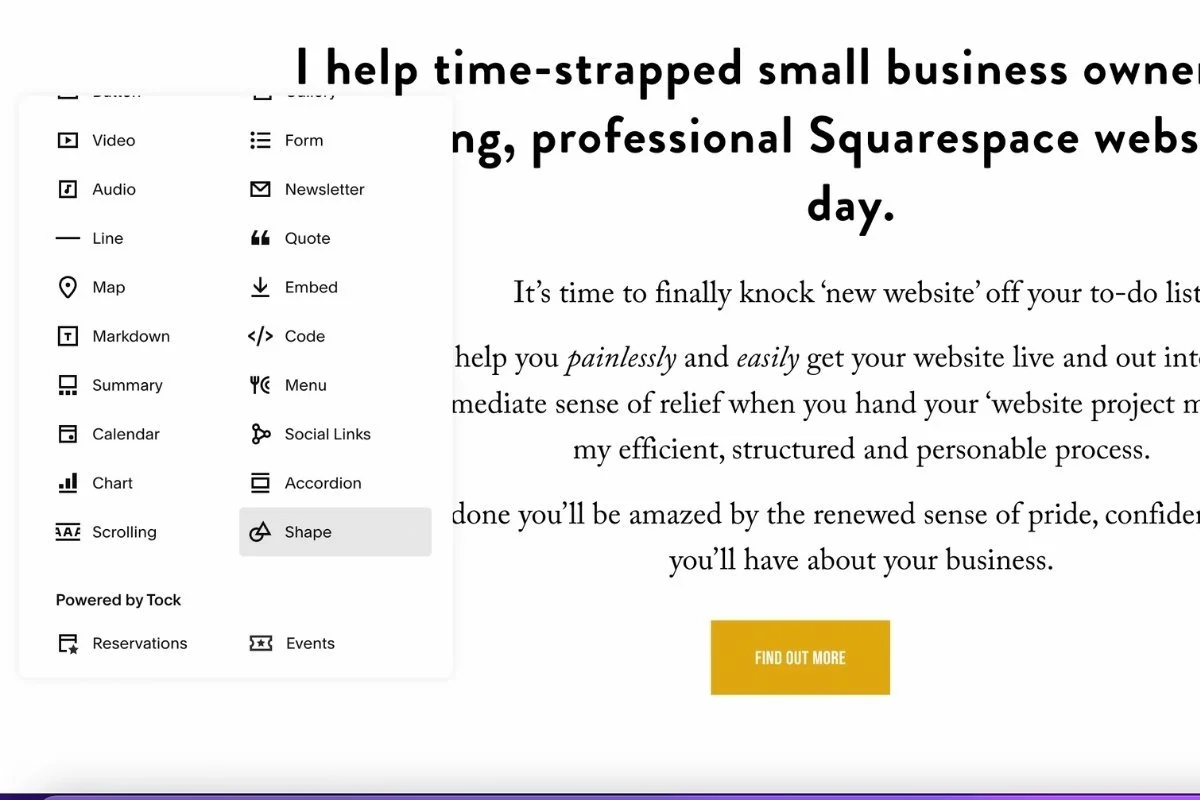
This is maybe one of my favorite new features. You can now use simple geometric shapes in your Squarespace design. You used to need to create images in Illustrator or Canva, save them as a transparent png file and upload them to your site.
Shapes are great for creating backgrounds, large panels of color, little accents. I’ve just scratched the surface of using this feature and I’m excited to do more.
3. Layering objects
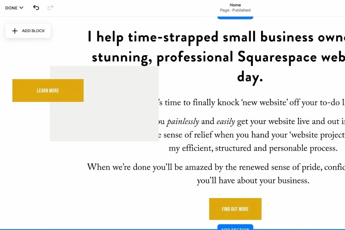
Another game changing feature, but one that’s also not that revolutionary. Now you can move images, texts and objects behind and on top of one another. A useful design technique that used to require CSS
4. Dragging and Dropping objects
Now in Squarespace you don’t add an object at a specific spot of your web page or section. Instead, you add an object from the menu in the upper left portion of the page section and drag and drop it anywhere (within the grid!) of your page section. Again a much more flexible system
5. Group Select
Another feature that has been standard in design software for years, decades even that is now in Squarespace. You can now select multiple objects and drag them to a new location or….
6. Copy and Paste
Another very standard but game changing development in Squarespace Fluid Engine. Some older or ‘Classic Editor’ features like Image blocks have been retired, which makes being able to copy and paste even more necessary. However being able to copy and paste an element or groups of elements makes designing soooo much speedier.
If I create a group of elements, say an image with a shape beneath it with a button sitting on the border. I can group select all the elements, then copy and paste, then copy and paste some more. That way multiple items can be duplicated almost instantly.
I seriously remember being shown how to do this in Aldus Pagemaker in the mid-90s! It’s about time, Squarespace!
7. Text box background colors
Squarespace Fluid Engine now allows you to add a color background to a text box, and adjust the padding as well. I’m finding I’m using the shape feature and then layering a text box on top of it. I can control the padding a bit more that way, but sometimes using the background feature is easier. I’m still experimenting with this feature.
8. Full bleed images and objects
When an image or object ‘bleeds’ that’s graphic design speak for going up to and over the edge. For example, in Squarespace Classic Editor, the only way you can get an image to go up to the left and right edge of the web page is to make it a background image.
In Fluid Engine you can pull the image all the way to the edge, regardless if it’s in the background or not. The same is true for shapes. This feature, combined with shapes and layering allows for a lot more design experimentation and flexibility.
There is a bit of a learning curve to Fluid Engine, but I have to say I love it.
There is one thing about Squarespace Fluid Engine that I don’t love. Editing the mobile view.
Mobile, or responsive design, was and is automatic in Squarespace Classic editor. A website design created for a laptop or desktop was ‘automagically’ converted into a design that worked in mobile.
On occasion this would be annoying.
If I created some design element using CSS it might not work in mobile and I’d have to either try and fix it for mobile or make a design decision about whether it was worth it to keep on the desktop design, or figure out a workaround.
This was the exception though. Usually mobile was an afterthought.
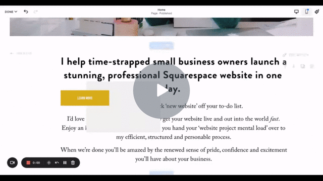
On my Launch in a Day one day website projects. I have a check list item to ‘check mobile’ usually this is a 2 minute flip through the pages, checking the color theme on the menu works, etc.
Fluid Engine has changed all that. Mobile is a MESS.
All of the items are out of order. You basically have to do a second design to get it looking half way decent.
This is a perfect illustration of the dilemma between designing with flexibility vs constraints.
Fluid Engine also doesn’t really work on a tablet or iPad. Squarespace has acknowledged this and has intimated that they are ‘working on it’ but this is not a satisfying explanation to give to my clients.
This has forced me to reduce the amount of pages I can do on a Launch In A Day. I’m fast, but I’m not a robot! I also don’t want to be forced to make a lot of design compromises just because I have to re-do everything for the mobile site design.
I’m also thinking about moving to more of a customized template model in the future to build in more predictability.
Right now when I start a Launch In A Day website it’s custom. I start from scratch. I might move that into a new custom offering. Stay tuned.
All in all, I can honestly say Squarespace Fluid Engine is a massive improvement and a big leap forward.
Squarespace has also been rolling out new features at breakneck speed (although I wish they would work this fast on Squarespace campaigns - a topic for another blog post!)
I really hope they get the mobile and tablet design issues sorted out. I have a feeling they will and for now, I’m all in with Fluid Engine.