5 Things A Perfect StoryBrand Website Absolutely Needs

Building a website that follows Building A StoryBrand principles is easier said than done. How do you translate the golden advice in this book into a compelling site that drives conversions? Read on to find out.
If you read only one book when thinking about a new website launch, make it Building A StoryBrand by Donald Miller.
One of the temptations when writing copy or coming up with messaging for your website is to go on and on about how great we are.
It’s understandable; we want to establish credibility and convince our potential client that they should hire us.
But this isn’t the best way to go about it.
The Building A StoryBrand Framework
What we should do is show the client that we understand him or her. We need to show that we understand their problem and what kind of pain it causes them.
Then we need show and prove that we are a trusted guide who can illuminate the path forward.
The ‘trusted guide’ part is where you can talk about yourself, but that’s only one part of the process.
Donald Miller, who has built an empire with his StoryBrand frame work. This frame work is encapsulated in his book Building A StoryBrand:Clarify Your Message So Customers Will Listen.
As the sub-sub header of the book indicates, he outlines the seven elements of great storytelling to grow your business.
I’ll cut to the chase and give you the seven elements here:
A character
Has a problem
And meets a guide
Who gives them a plan
And calls them to action
That helps them avoid failure
And ends in a success
The StoryBrand approach is to create all of your copy (website and marketing) using these seven elements as a lens through which to communicate.
For example, ‘A character’ is your ideal client. Who is this person? Figure that out and keep it in mind when you’re writing your copy.
Is she casual, serious, buttoned up and business-like? What kind of tone you’ll use when communicating with her?
This character has a problem. What is it? In my case my ideal clients need a website, but that’s just the surface problem.
There is so much more than just the ‘presenting need’, there are usually deeper needs: wanting to feel confident about her business, feeling embarrassed by an existing website, feeling overwhelmed and frustrated by the whole endeavour of getting a new website live.
These deeper needs are the needs you need to address with your website.
The book goes deeper into each step and there is an entire chapter dedicated to how to use these techniques on your website.
I have read A LOT of marketing books, I found this one to be the most clarifying and actionable when it came to figuring out how to communicate with my ideal clients.
I even created a graph which each of the steps and wrote out what these were for my clients. As I get feedback both before and after projects, I plug in phrases I notice my clients use do describe their frustrations around their websites (or lack thereof) and how they feel afterwards.
The most powerful bits of copy you can use are phrases that come from your clients themselves.
This book is so good, It’s recommended reading in my Launch & Thrive Biz Kit. You’ll have multiple ‘aha!’ moments while reading this book.
5 Things your StoryBrand Website Must Have
#1 An Offer above the fold
In case you don’t know what ‘the fold’ refers to, this is the part of your website that is on the screen before you need to start scrolling. This is a term that originates from the old days of print. ‘Fold’ refers to the fold in a newspaper. Everything above that section is what’s important.
The offer is not just your service or product. It’s the transformation you’re promising to your client or customer.
According to Miller, everything above the fold should be ‘Short, enticing and exclusively customer-centric’.
Your images and text must do one of these three things:
Promise an aspirational identity
Promise to solve a problem
State exactly what you do
I often find clients bury this message in their copy. For example, one of my favorite clients, The Libra Project, offers workshops that helps burnt-out lawyers questioning their chosen path and looking for more.
This is what their website looked like before we worked together:
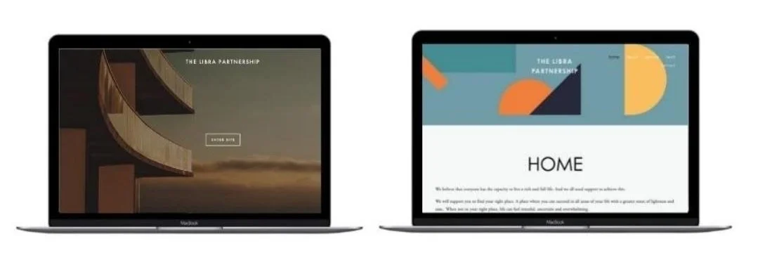
There really isn’t an offer or anything that speaks to their clients deeper need.
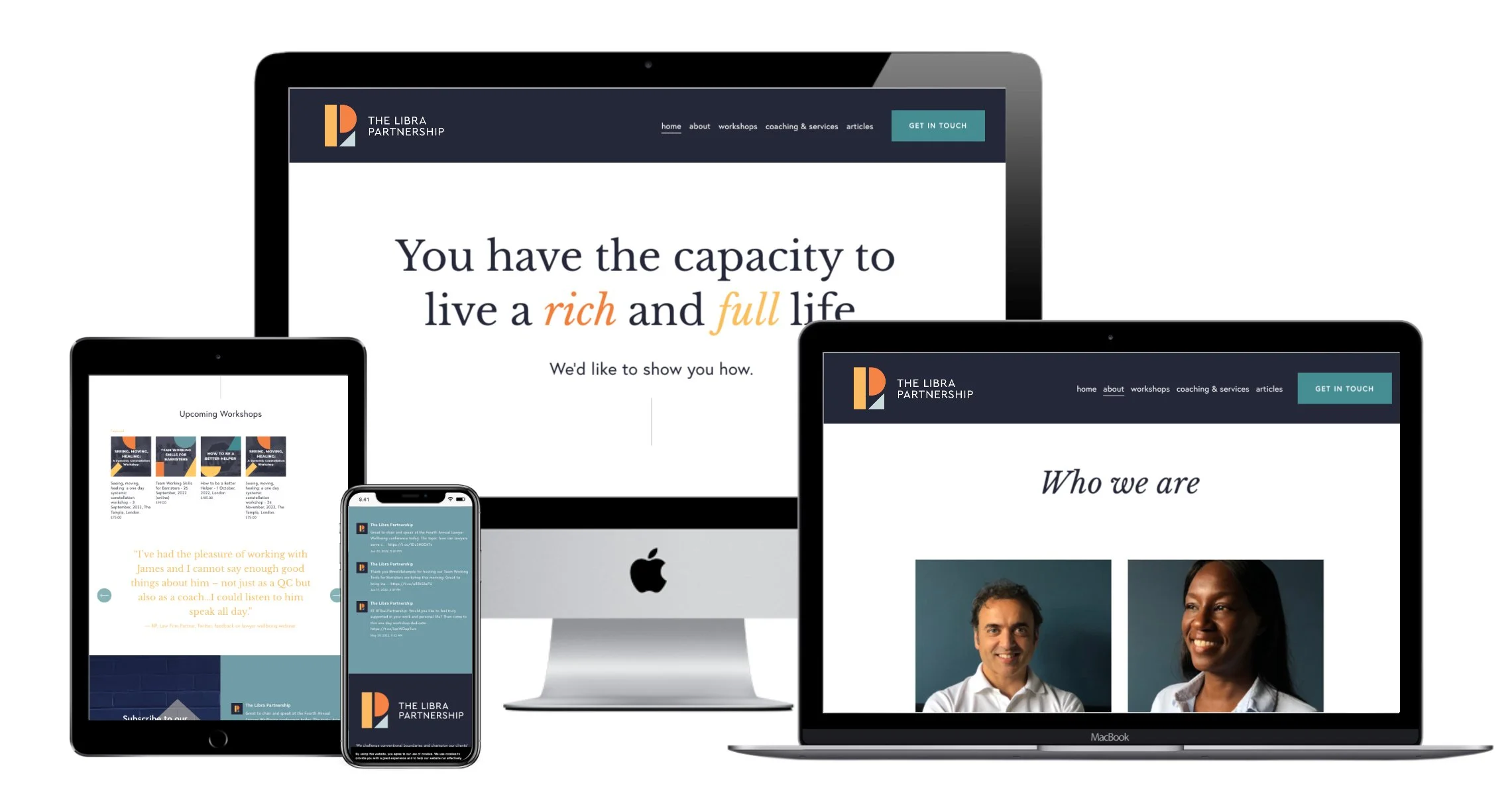
The line ‘You have the capacity to live a rich and full life’ was buried in the copy of the original home page. Tapping into their clients capacity to live a rich and full life is the offer, this is the transformation The Libra Project provides.
That is now the message that is front and center on the home page.
#2 Obvious calls to action
This sounds like a no brainer but it often goes missing. You need to have buttons with clear, non-passive calls to action on your (Book A Call, Buy Now, Save My Spot) There are two very specific places these ‘CTAs’ should be. In the upper right corner of your website, and in the center or somewhere on the hero section of your site, again, above the fold.
#3 Images of Success
Donald Miller suggests that images of ‘happy people who have had a pleasurable experience by engaging with your brand’ featured on a website.
I don’t disagree with this however I don’t take this guidance literally. All websites would start looking very similar if that were the case.

There are ways to communicate happiness and satisfaction that aren’t that on the nose. For businesses that are personal brands, it’s also often important to have a smiling picture of the person that is the business on the website.
Think of personal brands like Amy Porterfield with her portrait on the home page, or even the Storybrand website itself thas a video of a person working which cuts to Donald Miller speaking on a stage.
Sure, there are smiling happy people elsewhere on the site (often in testimonial images) but these don’t need to be the hero image.
It’s my job as a designer to understand what images are not only on brand, but will speak to your clients deeper needs.
#4 Bite Sized Breakdowns of your revenue streams
It can be hard to encapsulate your business in one key message, but usually there is an overarching theme. This message is what goes into item #1.
Breaking out your offers, products or revenue streams further down on your site can support this message adding more detail and clarification as to exactly what it is you do.
These sections usually lead to sales pages that go into more detail and may even have more specific ‘scripts’ or messages for different types of clients.

#5 Very Few Words
People don’t read websites, they scan them. Your website text needs to get straight to the point.
TL;DR. Too long, didn’t read. After you’ve written your text, cut it in half. Then cut in half again. Be ruthless.
Text also needs to be broken up visually. Paragraphs shouldn’t have more than three sentences.
When designing Storybrand websites I make sure to break up big chunks of text using varied typography. This includes headlines, sub headlines, italicizing where I can, bolding text and adding bullet and numbered lists.
My first line of defense, though, is just editing down the text from the start.